ESSEX WEBSITE BUILDERS / LOGO & VISUAL IDENTITY
Lailora logo
A little detail. A recognisable identity.
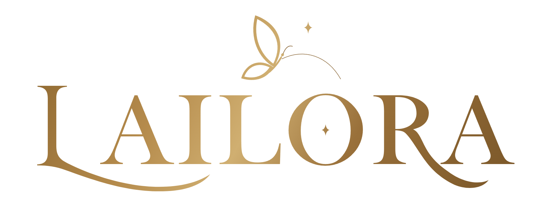
A gold serif wordmark pairs flowing letterforms with a butterfly and small sparkle details. The identity introduces Lailora’s personalised-gift shop with warmth and a sense of care, while a separate butterfly symbol carries the same character into smaller spaces.
Give a brand one recognisable signature, then let a smaller symbol carry its character across the rest of the experience.
Show me why
A gold serif wordmark pairs flowing letterforms with a butterfly and small sparkle details. The identity introduces Lailora’s personalised-gift shop with warmth and a sense of care, while a separate butterfly symbol carries the same character into smaller spaces.
The wordmark
Serif letterforms and extended curves give the Lailora name a distinctive rhythm. Clear space around the mark lets the lettering remain the focus.
The butterfly
A light butterfly drawing and small sparkle details connect the identity with the shop’s imaginative, personal tone.
The colour
A gold gradient gives the wordmark depth on a light background. The wider website places it alongside cream, deep green and terracotta.
The story
behind the screen.
The challenge, the approach, and the work that brings the experience together.
Personalised gifts / brand identity
A name with its own character
The Lailora wordmark makes the name the centre of the identity. Serif lettering, flowing lower strokes and small decorative details create a signature that feels expressive without relying on product photography.
One identity, two scales
The full wordmark leads the storefront header. A standalone butterfly appears elsewhere in the experience, giving the brand a smaller visual signature for moments where the complete name is not needed.
From logo to storefront
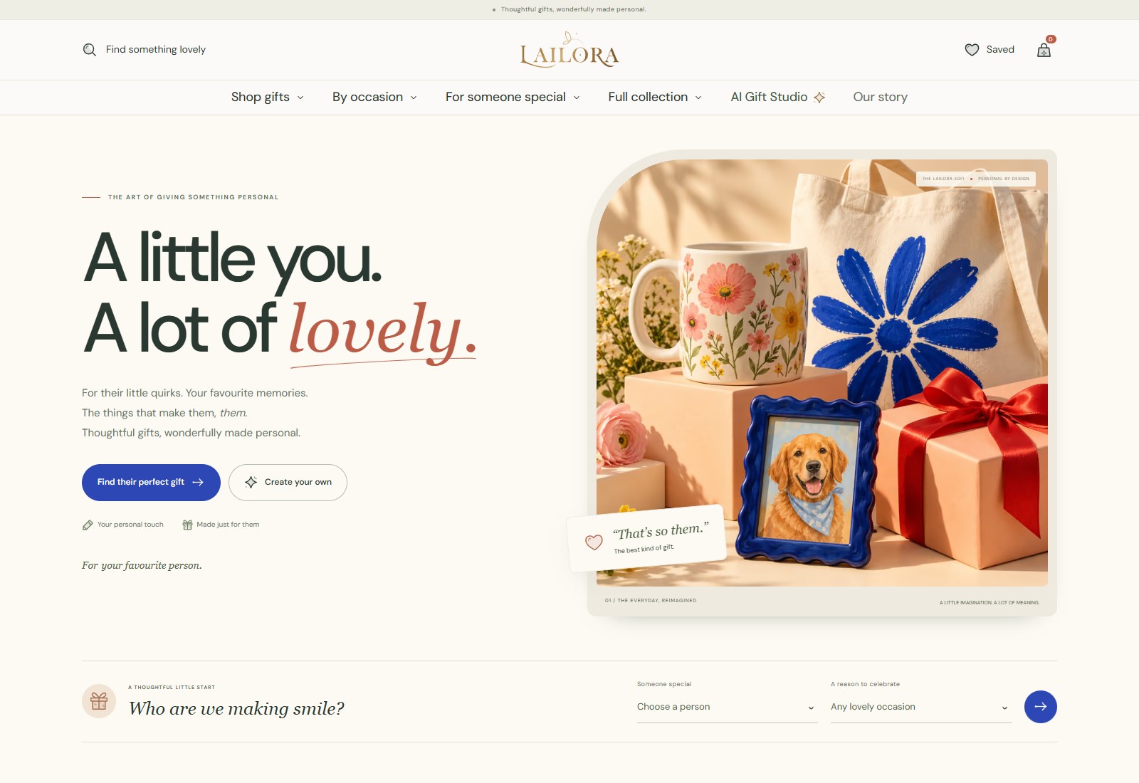
The gold identity sits within a warm website palette and an editorial approach to typography and imagery. Seeing the mark in the live shop shows how a logo can introduce a wider design language, from the first impression to the creative studio.
Project scope
- Logo and wordmark design
- Butterfly brand symbol
- Gold colour treatment
- Identity applied across the online shop
An identity.
In its own world.
The wordmark introduces the shop, while the butterfly repeats through the wider experience. The website gives the identity a practical setting alongside products, navigation and calls to action.
Explore the Lailora.shop website project ↗