

← All our work
ESSEX WEBSITE BUILDERS / LOGO DESIGN
Essex Scrap
A clear identity connected to the service
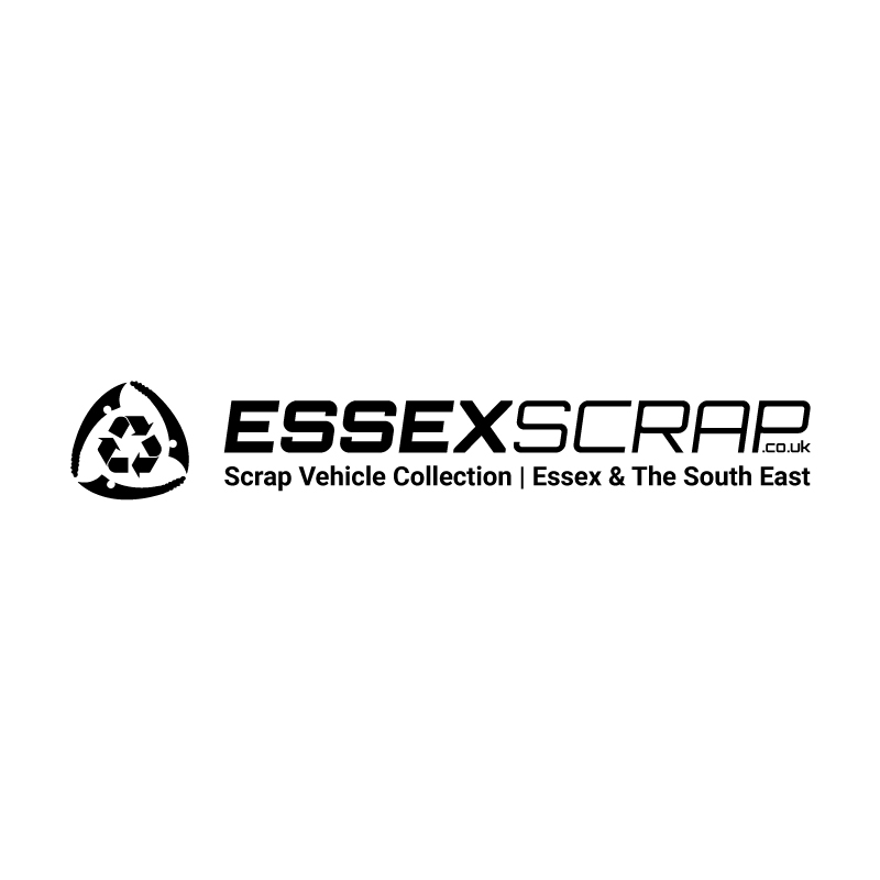
Bold lettering, a recycling symbol, and a descriptive strapline combine in a horizontal mark. The name and service explanation sit together in one composition.
A USEFUL IDEA TO TAKE AWAY
Explore the project ↗A brand mark that connects a name with a clear service description.
A CLOSER LOOK / ESSEX SCRAP
Show me why
Bold lettering, a recycling symbol, and a descriptive strapline combine in a horizontal mark. The name and service explanation sit together in one composition.
The symbol
The recycling motif relates directly to the service.
The name
Bold typography gives the business name a clear position.
The context
A strapline adds a practical explanation.